Blog
What is Mid-Century Modern Lighting?

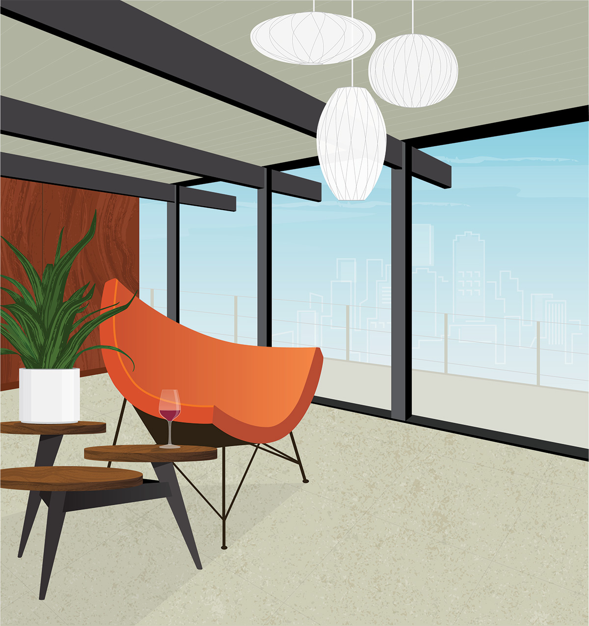
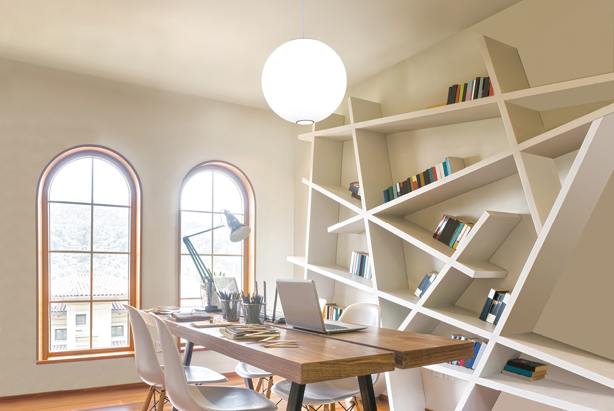
Mid-century modern lighting design is a style that emerged in the mid-20th century. It’s commonly characterized by its use of clean lines, simple forms, and a focus on function. Features that can help you spot mid-century modern lighting include:
Sleek, simple forms: Mid-century modern lighting is known for its clean lines and lack of ornamentation. This style often features lighting fixtures with simple, streamlined shapes that emphasize form and function.
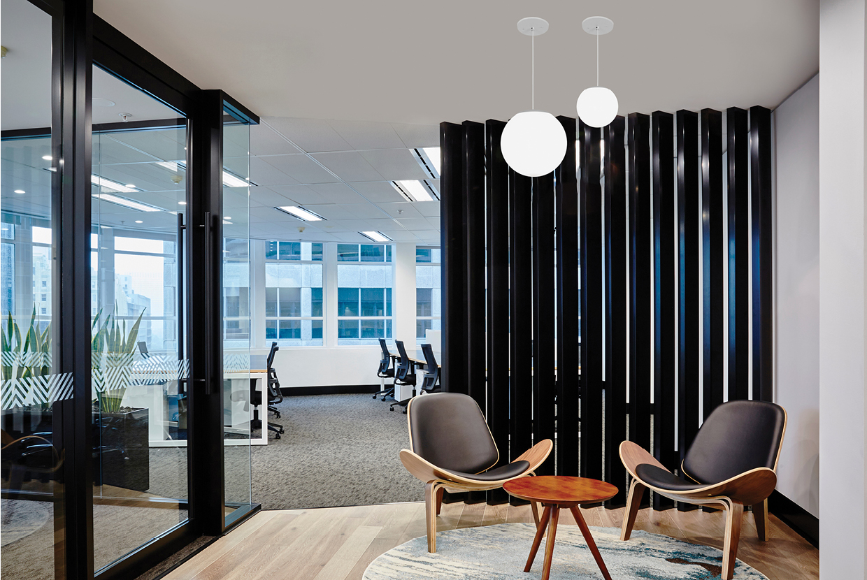
Geometric shapes: Many mid-century modern lighting fixtures feature bold, geometric shapes, such as circles, squares, and triangles. In fact, these shapes may be part of the reason why the mid-century modern aesthetic has remained so popular over the years – it’s just plain fun!
Use of materials: Mid-century modern lighting often incorporates materials like glass, metal, and plastic. Glass shades are common, as are metal accents and bases. Other times, the entire fixture may be made from plastic.
Function-focused design: Known for its focus on function, mid-century modern fixtures are often designed to provide practical, effective lighting rather than to make a decorative statement. You’ll see sleek, streamlined forms and sometimes adjustable features like adjustable arms or swiveling shades when you look through images of mid-century modern lights.
Retro aesthetic: New mid-century modern lighting fixtures typically have a retro aesthetic, evoking the design styles of the 1950s and 1960s. This can be seen in the use of bold, geometric shapes and materials like chrome or Lucite®.
What Defines Mid-Century Modern Interior Design?
There are a lot of opinions on what time period actually defines mid-century design. It’s closely associated with post Second World War through the 1960s. Some would argue this style originated as early as the 1920s because it’s heavily influenced by Bauhaus style and has similarities to Art Deco style. The clean, sleek lines of mid-century design make a lot of sense. There is a simple, yet futuristic quality to it that was the perfect answer to the ornate and more decorative styles that came before.
Color is another defining feature of mid-century design. Earthy tones of green, orange, red, yellow, beige, gray, or white neutrals paired with plastic, brass, or shiny chrome are instant clues as to when that design was inspired. Think avocado green appliances like TV’s Brady Bunch house or the subtle beiges of Don Draper’s Mad Men apartment/office, then you will have a good understanding of the colors involved.
History En Vogue
Why has the mid-century modern style continued to be popular and have more than one relevant resurgence? It may have to do with some of the same reasons that the style became popular in the first place. Considering the opulent and extravagant forms that came before, the desire for simplicity makes sense. Mid-century modern works well in small spaces. As more families moved into smaller, less ornate homes, these clean, modern forms felt right. Today, as people continue to live in smaller, more compact spaces, keeping a minimalist design aesthetic still makes sense. The colors and materials may have evolved over the years, but there’s little doubt we’ll continue to see these style trends over and over again.
Frankly, it’s often just a fun aesthetic to play with. If you want to include some mid-century elements in your new office design, consider using some globe lighting over a conference table. Or perhaps add an interesting element to your hotel lobby with lighting that has an eye-catching shape. You can also play with color, metal, and wood to add the right mixture of mid-century modern and contemporary styles.


